In the United States, airlines are often perceived by the public and portrayed in the media as not being customer-oriented and as focusing more on profits than on the experience of their passengers.[1] Along with anecdotal horror stories, passengers complain of high prices, nickel-and-diming, and limited options. Yet, in reality, the vast majority of fliers take their trips without incident, arrive on time to their destinations, and do so at relatively affordable fares.[2]
Consumer advocacy research supports the notion that what really matters to passengers is whether they can find affordable flights to where they want to go, and that they have some options on when to get there. Surveys, like the one conducted by the American Customer Satisfaction Index (ASCI) starting in 1994, give a measurable view of customer perception, as shown in Figure 1.[3] In 2016, airlines ranked higher than some entire sectors such as “telecommunications” (ASCI index of 70.1 in 2016) and “government” (70.3), but still below the top-performing industries of “manufacturing” (82.1) and “e-commerce” (82.4).[4]
Figure 1. American Customer Satisfaction Index
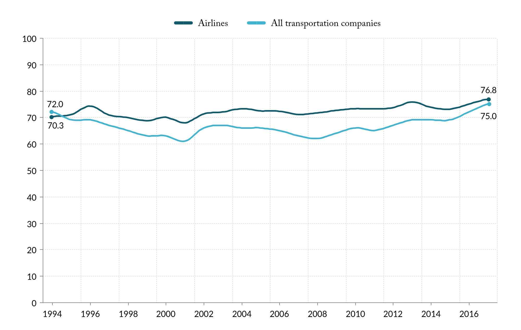
Source: American Customer Satisfaction Index, “Airlines” and “Benchmarks by Sector,” 2017.
The ACSI is based on surveys of all travelers on their perceptions of services along with complaints and loyalty. But beyond the national aggregate figures, it is important to understand the variation in aviation services in different metropolitan areas. Instead of a survey, Eno combined the factors that matter most to fliers to develop a new FlyScore, measuring the quality of service for each metropolitan area. This new metric takes into account the following four variables that matter most to fliers and regional economies:
- Direct destinations: Number of domestic destinations at each metropolitan area [5]
- Frequency: Number of domestic flights operated out of each metropolitan area [6]
- Competition: Combined percentage of domestic traffic share of the largest carrier within each
metropolitan area [7] - Price: Average one-way fare in and out of each metropolitan area [8]
Each variable was normalized on a 0-100 scale, with 100 as the best, with a total score calculated for each metropolitan area using a 25 percent weight for each variable (Table 1). Some regions—like New York and Chicago—have multiple airports, meaning business and leisure fliers have those combined options when they are selecting when and where to fly. As the table shows, metropolitan areas with more than one airport tend to have the highest scores.
[table id=4 /]
LEGEND:
Type of hub:
- L – Large hub
- M – Medium hub
Download Eno FlyScore Data here
Eno’s FlyScore includes frequencies, destinations, prices, and competition, but it omits some measures such as delays, the quality of airport facilities, the in-flight experience, and ground access. While these are important to consider, they either lack consistent data or they are subjective in nature and difficult to incorporate in a metric. Eno weighted the four factors evenly, as there is no scientific research that definitively places one factor of more importance over another. And this FlyScore analysis does not include a comparison over time, in large part because historical numbers of direct destinations is not openly available.
Chicago tops the list with a fly score of 94, significantly higher than the second, Denver, at 79. Chicago benefits from each of the factors. Chicago has the most direct domestic destinations in the country, with 170. While Atlanta’s airport has more flights than Chicago-O’Hare, Chicago Midway brings the total for the region higher than anywhere else. Chicago’s airports are also major hubs for United, American, and Southwest, meaning that no airline has more than 32 percent of the region’s market. Finally, Midway has the lowest average fare of any airport in the country. Using these metrics, Chicago is unbeatable.
But why do regions like New York, Los Angeles, or Miami not score better when they have multiple large airports serving them? The airports in these three regions have plenty of departures and high levels of competition, but they have significantly fewer direct destinations. Where Chicagoans can reach 170 domestic destinations on a direct flight, Los Angeles, New York, and Miami can reach only 100, 69, and 58, respectively. This is primarily a function of geography. Chicago is located centrally, and there are ample places that make sense to serve from that hub. The other three regions are coastal, making greater domestic destinations less feasible. Also, coastal cities are better positioned to serve international destinations, which are not counted in the FlyScore.
Source: Eno Center for Transportation estimates and Bureau of Economic Analysis, “Regional Economic Accounts,” U.S. Department of Commerce, 2017.
Comparing Eno’s FlyScore among regions is not always a fair. With metrics such as destinations and frequencies, larger markets, like Chicago, will inevitably get more service than a smaller region, such as Omaha. A comparison of the FlyScore with the regional GDP (Figure 2) yields a better analysis and shows how a region’s economy relates to the number of destinations, flights, prices, and competition in a region. As expected, the FlyScore is generally tied to underlying demand levels of each region, and the FlyScores increase with regional GDP. But some regions deviate from the trend: Las Vegas and Denver have much higher FlyScores with respect to the size of their regional economy, and Los Angeles and New York are much lower, in part for reasons described above.
When it comes to regions served by medium hub airports, Raleigh/Durham and Fort Myers stand out with relatively high FlyScores compared to regional GDP. The FlyScore for Raleigh/Durham is due to a combination of higher scheduled departures and lower average fares than many other medium hubs. But the main reason these two cities scored well is that they do not have a dominant airline. The largest share of passengers by any airline in Raleigh/Durham and Fort Myers is 22 percent at both airports.
On the other hand, Riverside/Ontario and San Jose are strong economically, yet have FlyScores of 37 and 45, respectively. While fares at those airports fall in the bottom third, they serve few destinations and both have more than 50 percent of flyers on one airline. Luckily for those regions, they are within a reasonable drive of large hubs with high FlyScores.
Where are airline passengers getting the best service?
Answer:• Although national consumer indices for airlines show steady growth in customer satisfaction since 1994, airline passengers receive different levels of service among metropolitan areas. Eno’s FlyScore gives an indication as to where passengers can access other parts of the country easily, inexpensively, and with choice.
• Eno’s FlyScore demonstrates that consumers receive the best service in the metropolitan areas with the greatest demand, measured by regional GDP. Among large hubs, Chicago, Las Vegas, and Denver stand out, as do Raleigh/Durham and Fort Myers among medium hubs as they score particularly high with respect to the size of their regional economies. Metropolitan areas with multiple airports also score well.
• Riverside/Ontario and San Jose, located next to Los Angeles and San Francisco, respectively, scored low when factoring in the size of their regional economies.
Eno Aviation Insights homepage
Question 5: How has air travel in specific metropolitan areas changed in recent years?
Question 7: What do we know about aircraft delays?
Eno wishes to acknowledge its Aviation Working Group, a standing advisory body that provides Eno staff with guidance and expertise on all matters related to aviation policy. The opinions expressed are those of Eno and do not necessarily reflect the views of our supporters.
[1] See e.g.,: Blake Fleetwood, “Why Americans Hate Their Airlines,” Huffington Post, April 13, 2017.
[2] Eno Center for Transportation, “Is Air Travel Becoming Pricier for Travelers?” Eno Aviation Insights, October 2017.
[3] Besides the ASCI metric, there are other indexes published by a number of entities that try to capture consumers’ experiences with airlines. For example, JD Power publishes an annual “airline customer satisfaction” metric. The latest report shows a three-percentage point increase from 2016 to 2017, with customer satisfaction continuously improving since 2013. See: J.D. Power Ratings, “Despite Inflammatory Incidents, Airline Customer Satisfaction Keeps Improving, J.D. Power Finds,” May 10, 2017. Another index is the one published by Embry-Riddle Aeronautical University and Wichita State University, the Airline Quality Rating (AQR). This index uses U.S. DOT data on denied boardings, mishandled baggage, and customer complaints, with different weights given to the different variables. Using this metric, the airline industry as a whole has improved its performance over the past 20 years. The AQR in 2016 was 39 percent higher than the AQR in 1997. This is a trend that the majority of airlines have been following. See: Brent D. Bowen and Dean E. Headley, “Airline Quality Rating,” Embry-Riddle Aeronautical University and Wichita State University, 2017.
[4] American Customer Satisfaction Index, “National, Sector, and Industry Results,” 2017.
[5] Kayak.com, Kayak Direct, 2017.
[6] Bureau of Transportation Statistics, “Airport Snapshot,” U.S. Department of Transportation, 2017.
[7] Ibid.
[8] Office of Aviation Analysis, “Domestic Airline Consumer Airfare Report,” U.S. Department of Transportation, 2017.