March 1, 2019
With the recent decision of the Governor of California to slow down (at a minimum) plans for construction of the state’s high-speed rail project outside the Merced-Bakersfield “Central Valley” segment, there has been a round of articles in the media along the lines of “why can’t the U.S. build high speed rail, when Europe/Japan/China are so good at it?”
It’s a complicated question, but the biggest underlying factor – population density – is hard to describe in prose, and statistics are boring. And good visualizations were hard to find – until now.
In researching this question, I ran across a wonderful Internet tool called World Population Density. It uses the resident population GIS dataset from the Global Human Settlement Layer (GHSL) produced by the European Commission JRC and the CIESIN Columbia University and puts all that information in a map format that can be navigated in a web browser similar to Google Maps (powered by CARTO). The site design is by Duncan Smith.
The site allows easy visualization of comparative resident population density, per square kilometer, for any part of the globe, zooming in and zooming out to a variety of scales. One you find a scale you like for one area, you can then just rotate the earth around to another area to see the comparative population density of the other area at the same scale.
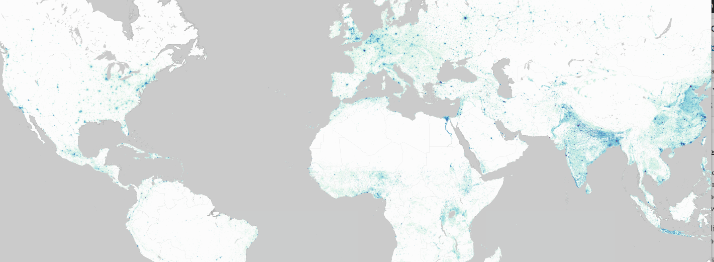
At the widest shot possible, here is the population density of the entire planet, from about 60 degrees north latitude to about 15 degrees south latitude (where the bulk of the population is):
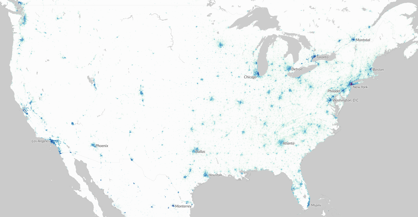
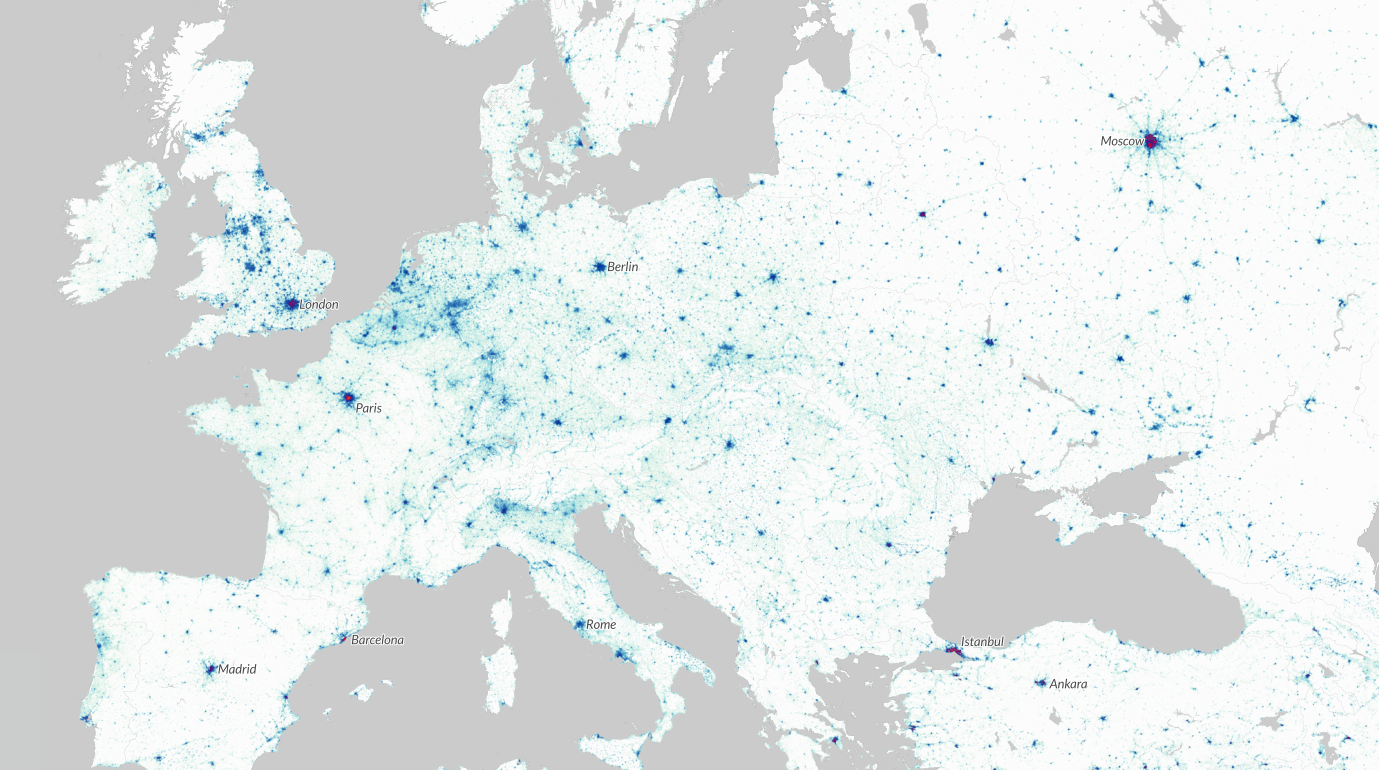
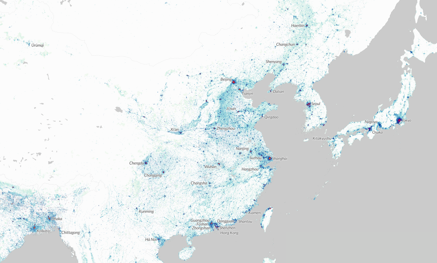
Then I magnified the map so that the lower 48 states of the U.S. filled the screen, and then compared to the exact same square area of Europe and of China-Japan.
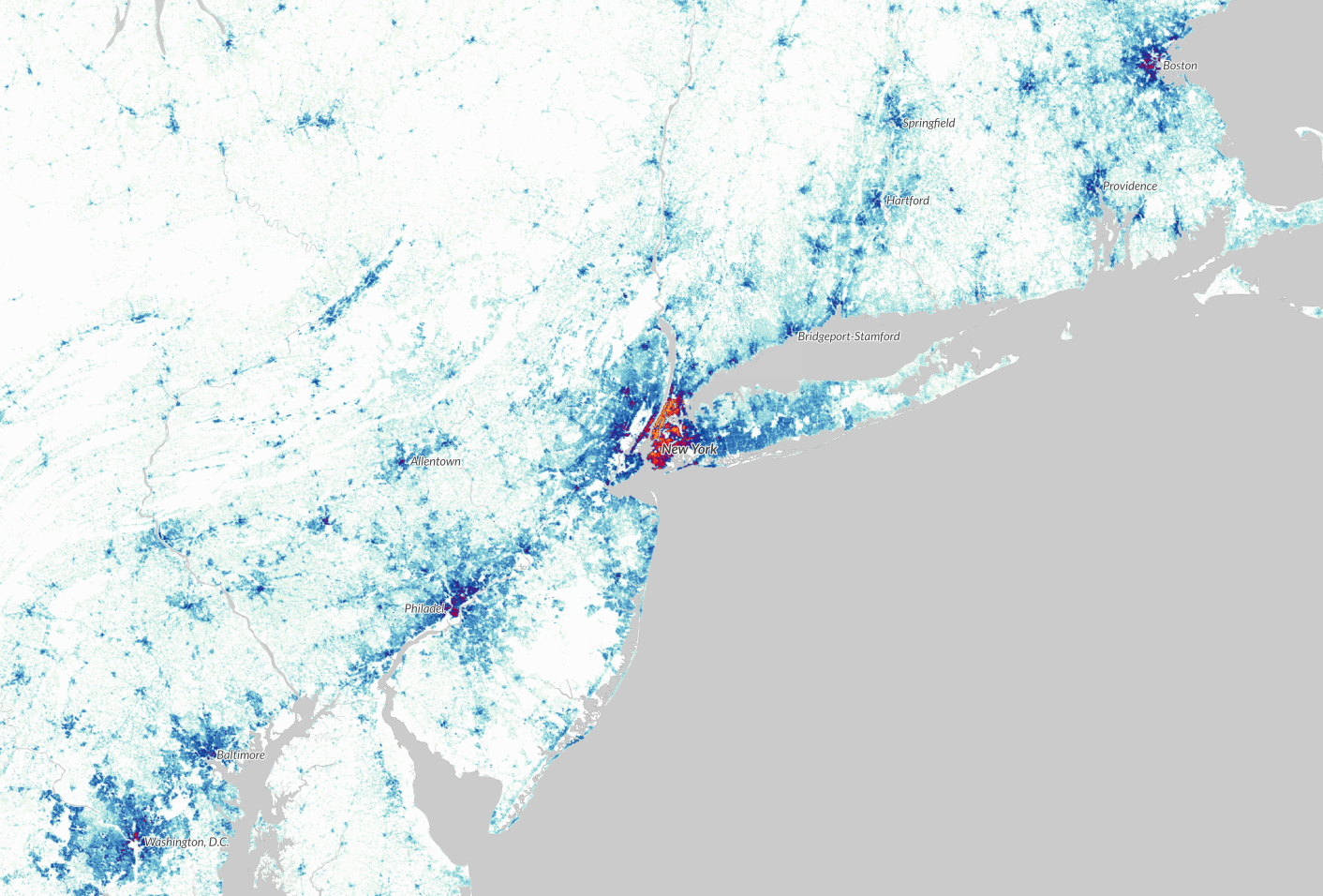
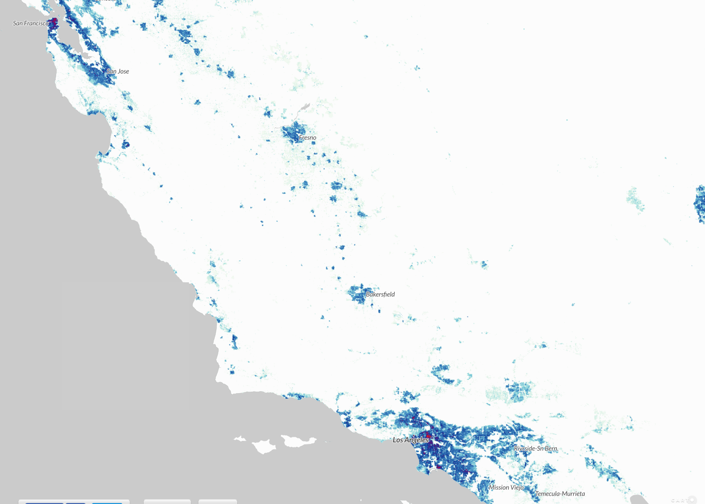
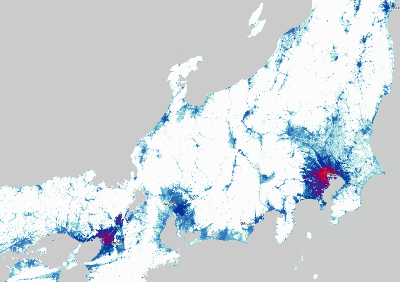
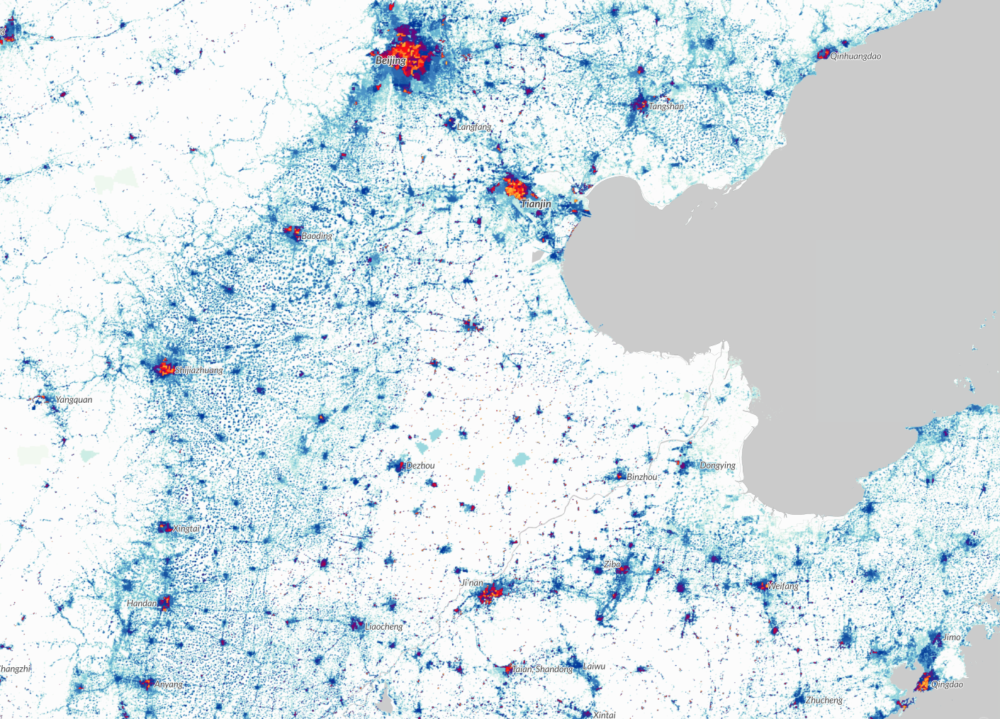
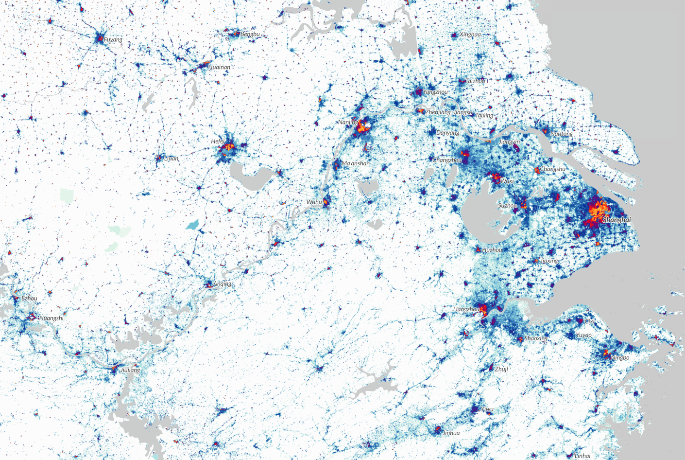
Then I zoomed further so that the 457-mile Northeast Corridor would fill most of the browser window. (At this point, you can see peak density shades that exceed the normal light blue to dark blue color range. 12-15 thousand per square km is purple, then you get into red at 22-28 thousand pskm, and then the more density you get you go into orange and the finally yellow.) Here is the NEC followed by California and then equivalent size segments of Japan (from Sendai in the north to just short of Hiroshima in the south) and then two shots of China (northeast China from Beijing down to Quingado, and then east-central China around Shanghai) for comparison.
Boston, MA to Washington, DC population density:
San Francisco, CA to Los Angeles, CA population density:
Central Japan (Sendai-Osaka) population density:
Northeast China population density:
East-Central China population density:
For fixed-guideway mass transportation (whether by railroad, or subway/elevated rail, or bus rapid transit), there’s just no substitute for population density as a measure of the need for, and likely success of, the system.
(And have fun with World Population Density, it’s an awesome tool to bookmark.)
