House Appropriators Fuel FHWA Font Fight
July 20, 2017
If nothing else, 2017 is a blockbuster year for transportation policy – that is, assuming you like to watch low budget reboots of old thrillers in slow motion.
This summer, Congress is wrestling with the prospect of an as-yet unseen trillion-dollar infrastructure package, a contentious battle over privatizing air traffic control, partisan divisions over motor vehicle standards for emerging technologies, and – you guessed it – changing the font of highway signs.
Currently, states and localities can choose whatever font they want for their signs… as long as it’s Highway Gothic. This is the same font that has been used almost exclusively since it was developed in the World War II era.
Since then, researchers developed another font, Clearview, which is designed to be more visible from a distance. Clearview had a brief stint as the only other accepted highway font for about a decade before the federal government informed states they could no longer use it for new signs.

Clearview is found to be more readily visible, especially for elderly drivers, for two reasons: design and the human brain.
When Highway Gothic was designed, the objective was to have big, bold letters that could be seen from a distance individually. But when headlights shine off of highly reflective roadway signs, the chubby letters of Highway Gothic’s thicker font can sometimes appear to be a glowing glob of indistinguishable letters. This blurring of letters is called halation, and is especially problematic for elderly drivers whose eyesight is deteriorating.
For this reason Clearview uses letters that are intentionally spaced and shaped to mitigate halation, as seen below.
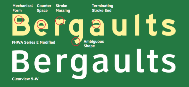
Side-by-side comparison of “Highway Gothic” and Clearview typefaces (Meeker & Associates)
Furthermore, the human brain recognizes words by remembering what the whole word looks like – not the individual letters. According to an MIT and Texas A&M study comparing the two fonts, “[the] legibility of Clearview is superior, regardless of color combination, suggesting that its legibility arises from characteristics intrinsic to its design rather than extrinsic factors (e.g., type size and text contrast and brightness).”
Two proposals before Congress this year may resurrect this upstart font.
The House Transportation-HUD Appropriations bill, released earlier this month, would allow jurisdictions to choose between using Clearview or Highway Gothic for their roadway signs in the FY18 fiscal year. The bill report states that its provision on highway guide sign fonts “prohibits funds from being used to enforce actions terminating the interim approval of [Clearview] during fiscal year 2018.”
The report also requires FHWA to conduct a comprehensive review of prior research on Clearview as well as the safety and cost implications of FHWA’s 2016 decision to terminate its approval of the Clearview font. The agency is required to report back to the committee within 90 days of enactment.
In April, Reps. Sam Johnson (R-TX) and Eddie Bernice Johnson (D-TX) introduced a bill that would direct the FHWA to issue a final rule approving the use of Clearview font on guide signs. The Safe Innovative Guide signs for the Nation (SIGN) Act (H.R. 2029) would reverse the FHWA’s 2016 decision to terminate its interim approval for the use of Clearview.
“With millions of Americans on the road every day, road signs play an important role in keeping folks safe. It’s just common sense that the clearer a sign appears, the sooner someone can read and react to it,” Rep. Sam Johnson (R-TX) told ETW in a written statement.
Several jurisdictions have expressed support for permanently reinstating Clearview – especially those which previously used it. Among them: Texas Department of Transportation, Virginia Department of Transportation, Pennsylvania Department of Transportation, Michigan Department of Transportation, and the Maricopa Association of Governments.
“The aptly named Clearview font has been extensively adopted on road signs for over a decade, and Washington’s transportation bureaucrats’ decision to prohibit the further use of this font in Texas and other states defies logic,” said Sam Johnson.
Clearview in the Rearview
Shortly after it was created by the Public Roads Administration (FHWA’s predecessor), Highway Gothic was used for road signs on a network of highways in Northern Virginia (then known as the Pentagon road network) in 1942. Its role as the nation’s uniform highway font was formalized in 1958, when an AASHTO manual for Interstate signs made Series E Modified the national standard for mixed case (upper and lower case) signs.
The six typefaces in the Highway Gothic font are identified on the scale of Series A-F. Each has specific uses, depending on width, and are on a scale of least (Series A) to most narrow (Series F).
These are all defined in the Federal Highway Administration’s (FHWA) Standard Alphabets for Traffic-Control Devices. Series E Modified, for example, with its thicker stroke width, is used for freeway guide signs (see below).

(Source: Manual on Uniform Traffic Control Devices (MUTCD), 2009 Edition)
For nearly five decades, it stayed that way. Then, in 2004, FHWA issued a memo that stated it would grant interim approval to any jurisdiction that submitted a written request to FHWA to use Clearview font for positive contrast signs. This was not a directive for jurisdictions to use Clearview, but instead gave them the option to use it for new signs.
The agency cited research that found Clearview to be more visible than Highway Gothic, yielding a 16 percent improvement in sign recognition by older drivers. The same study also found that Clearview enhanced legibility for drivers traveling at 45 miles per hour by 80 extra feet of reading distance, or “a substantial 1.2 seconds of additional reading time.”
Over the next 10 years, FHWA granted interim approval to 30 jurisdictions to use Clearview under Interim Approval IA-5. For the most part, the font appeared to be working just as well – if not better – than Highway Gothic. Some jurisdictions even adopted Clearview font for nearly all of their signs. Michigan, for example, has Clearview on 93 percent of its freeways and 43 percent of its conventional roads using it.
But by 2014, it was suddenly revealed that FHWA was no longer sold on the new font. FHWA declined IA-5 requests from Grays Harbor County in Washington and the Texas Department of Transportation to use Clearview.
The director of the FHWA Office of Transportation Operations, Mark Kehrli, sent the county a letter arguing that early research into Clearview was rather unclear:
“After more than a decade of analysis, we learned—among other things—that Clearview actually compromises the legibility of signs in negative-contrast color orientations, such as those with black letters on white or yellow backgrounds like Speed Limit and Warning signs… Based on these and other reasons, we expect to rescind the Interim Approval in the near future.”
Indeed, the 2004 memo was reversed in January 2016 when FHWA issued a notice that Interim Approval IA-5 was terminated. The notice stated, “subsequent evaluations showed no benefit to the narrower letter forms and degraded sign legibility when compared to the corresponding FHWA Standard Alphabet series.”
FHWA said that Clearview fonts were less legible when they aged – and that the initial comparisons were incorrect, since new Clearview signs were being placed to older Highway Gothic ones. Essentially, FHWA said, we might have been tricked in a way: signs with Clearview font were not inherently more legible – they just looked sharper because they were new.
However, a study by the Michigan Department of Transportation just months before had found that upgrading to Clearview font and yellow sheeting would cost just $41-46 more/sign.

Michigan DOT found that using Clearview on a sign with fluorescent yellow sheeting has a significant crash reduction potential, especially for people 65 years and older. They concluded that countermeasures like Clearview and fluorescent yellow sheeting would help to prevent crashes by enabling drivers to see signs sooner. Moreover, the state would not only reduce the human toll of collisions, but the economic tolls of emergency response and crash cleanup costs.
But unless the Clearview bills in the House pass, Clearview is likely to fade away from the roads of Michigan and other states as their signs are gradually retired and replaced.
And to Rep. Sam Johnson, losing this safety-enhancing opportunity is not acceptable:
“The aptly-named Clearview font has been extensively adopted on road signs for over a decade, and Washington’s transportation bureaucrats’ decision to prohibit the further use of this font in Texas and other states defies logic. That’s why I introduced the SIGN Act – to give states the opportunity to once again use the driver-friendly, easy-to-read font.”
[Update: July 31, 2017] The Senate Transportation-HUD Appropriations Committee also jumped into the debate with the release of its FY18 bill in late July. While Clearview was not mentioned in the bill itself, the accompanying report directed FHWA “to reinstate Interim Approval IA–5 unless there is sufficient information to demonstrate no improvement in the overall effectiveness of signs from the use of Clearview.”
