May 12, 2016
(Ed. Note: This article was supplemented with another article on May 11, 2017 that added spending on grants for water and sewer infrastructure and also focused on historical average spending levels.)
Next week is Infrastructure Week here in Washington DC, a coordinated attempt to get federal policymakers and the public engaged in understanding the importance of infrastructure at all levels of government. It is also often used to raise support for proposals increasing the levels of government spending to build and maintain said infrastructure.
But federal spending is usually only compared to the prior year (for annual appropriations) or to the last multi-year authorization bill. How do current federal spending levels for transportation infrastructure compare to the funding levels of prior Administrations over the decades?
Each year, the President’s Budget includes a volume of historical tables to put proposed fiscal policies in as broad a context as possible. Some detail on government-wide spending and taxes goes as far back as 1789, but the tables include a detailed breakdown of federal spending going back as far as 1940. Since it’s pointless to compare domestic spending priorities during World War II with those of peacetime, we decided to cut the timeframe off at an even 70 years (fiscal years 1947 through 2016) and compare seven decades of federal spending levels on transportation infrastructure programs.
A few things to remember:
- The historical tables in the President’s Budget only report in terms of outlays prior to 1976. Outlays are the cash leaving the Treasury to liquidate an obligation, so outlays lag behind Congressional funding decisions or Administration policy changes by several years (especially in slower-spending capital programs).
- The outlay information shown below includes the one-time spending from the FY 2009 ARRA stimulus bill, which largely played out in FY 2010-2011 for highways and mass transit but which is only now showing up in significant amounts for rail programs.
- The format of the President’s Budget separates direct federal spending from grants to state and local governments, even if the grants and the direct spending are for basically the same thing. Accordingly, the charts below only show spending from grants to state and local governments for transportation infrastructure, not direct federal spending like highways on federal lands or grants to Amtrak (a federally-owned corporation).
The farther back one goes in time, the less meaningful the comparisons in terms of nominal dollars. In 1947, the federal minimum wage was 40 cents an hour, and consumer prices have risen about tenfold over the seven decades since. A better comparison is how such spending holds up as a share of the entire economy (gross domestic product).
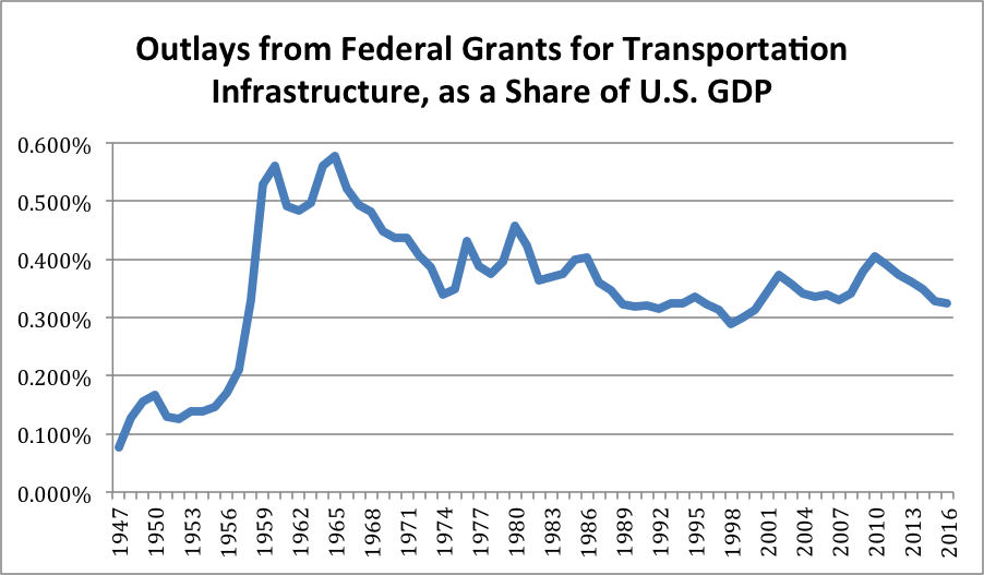
Put into this perspective (a share of the economy), the construction of the Interstate highway system was a truly heroic endeavor, quadrupling federal spending on grants for transportation infrastructure in just a few short years. But the current federal spending levels on infrastructure – though they may be inadequate to achieve desired outcomes in terms of building and maintaining systems – are right where they were throughout the 1980s, as new Interstate construction was petering out.
However, within that total spending levels, the priorities have changed somewhat over the decades.
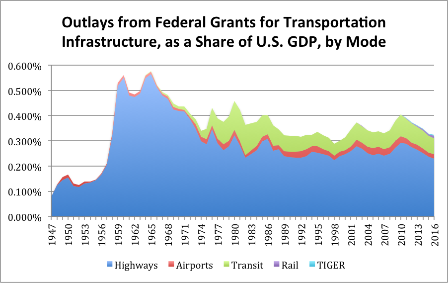
After an explosion of new mass transit spending in the 1970s (most of it contract authority from the general fund, the creation of which was banned after 1974), the regularization of an annual share of motor fuel tax revenues for mass transit ensured a fairly steady stream of mass transit money as a share of GDP.
Both of the charts shown above share common methodological problems. Like any fraction, the share of GDP spent on a particular program or function depends on both the numerator and the denominator. So the fluctuations in the chart are a result of both changes in actual dollar amounts from year to year but also the relative growth or contraction of the economy as a whole. This is why the spike in FY 2009-2012 is so pronounced – the ARRA stimulus tried to flood the system with money while the economy was contracting or stagnant. Similarly, the FY 2001-2002 spike reflects not only the increase in outlays under the TEA21 law but also the economic stagnation after the dot-com bust.
Stepping aside from the question of infrastructure’s share of the overall economy, how do the actual dollar amounts being spent on transportation infrastructure hold up over time? The President’s Budget also includes a series of tables that show inflation-adjusted dollars tied to a base year (the last time they re-based was 2009). In terms of 2009 dollars, federal spending on transportation infrastructure, while off its ARRA peak, still dwarfs the spending levels at the heyday of Interstate construction.
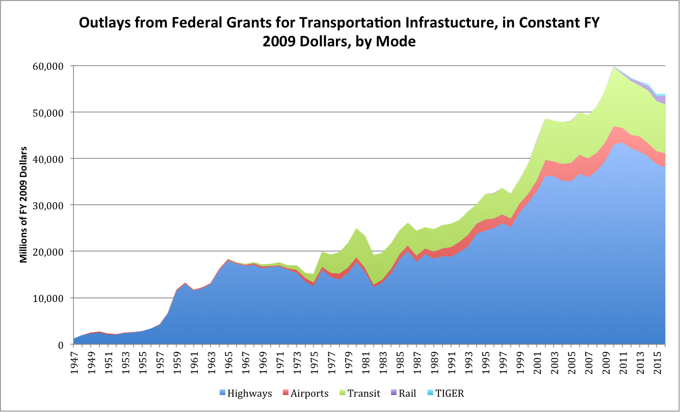
In terms of a share of GDP, federal transportation infrastructure spending (as measured here, in grants) peaked in FY 1964 at just over a half-percent of the whole economy. But in terms of inflation-adjusted 2009 dollars, that FY 1964 total only added up to about $16.2 billion. The comparable FY 2016 total is $54 billion (in 2009 dollars), but that money now constitutes just under one-third of one percent of GDP.
One last measure – in terms of dividing up the federal pie, how have transportation infrastructure grants held up over the decades? The following chart shows the outlays from transportation infrastructure grants as a percentage of total federal spending.
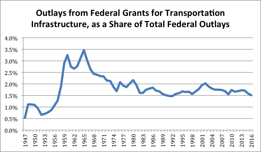
The shape of this line is remarkably similar to the shape of the line in the first chart, reflecting the relative constancy of federal spending as a share of the total economy, especially over the last 40 years. Again, as a share of the total budget, spending on transportation infrastructure is still higher than it was in the early 1990s and is roughly comparable to where it was before the ARRA spike.
So as ETW readers are busy participating in Infrastructure Week events, please remember that while current infrastructure spending levels may not be enough to accomplish all that infrastructure advocates want to achieve, the idea that the we are now spending significantly less money than we used to on infrastructure (at least over the last 40 years or so) is misplaced.
(Ed. Note: This article was supplemented with another article on May 11, 2017 that added spending on grants for water and sewer infrastructure and also focused on historical average spending levels.)
(Footnote: Here is how the President’s Budget describes how they calculated the FY 2009 constant dollars: “The term ‘constant dollars’ means the amounts of money that would have had to be spent in each year if, on average, the unit cost of everything purchased within that category each year (including purchases financed by income transfers, interest, etc.) were the same as in the base year (Fiscal Year 2009). The adjustments to constant dollars are made by applying a series of chain-weighted price indexes to the current dollar data base.”)

